Project Case Study
Sushi Takumi Website
A modern Japanese restaurant marketing website for Sushi Takumi, focused on fast menu discovery, direct conversion to reservations and online ordering, and a clean multilingual-ready content structure.
View Live Project →Overview
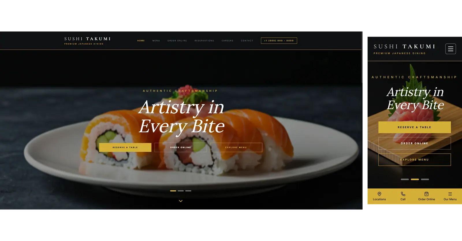
Sushi Takumi is a restaurant marketing website built to support one clear behavioral pattern: visitors arrive with intent and want to act quickly.
The site is structured to communicate the brand first, then move users directly into high-intent flows:
browse food and drinks
reserve a table
place an online order
contact the restaurant
The information architecture keeps these actions visible across the main navigation and section CTAs so users can decide and act without friction.
Objectives
Present a premium Japanese dining brand with immediate visual clarity
Reduce time-to-menu through direct navigation and section-level CTAs
Route transaction intent efficiently to online order and reservation channels
Keep operational pages (Careers, Contact) available without distracting from core conversion actions
Maintain a simple content structure that is easy to update as menu and campaigns evolve
Audience and UX Constraints
Restaurant visitors are usually task-driven and impatient. Typical first-session goals are:
"I want to see the menu quickly."
"I need to reserve now."
"I want delivery or pickup."
The UX is optimized around those constraints:
concise top navigation
direct links to conversion destinations
minimal detours between discovery and action
mobile-friendly scanning for menu and operating details
Information Architecture
The product flow follows a practical sequence: discover -> evaluate -> act.
Home
brand positioning and hero messaging
direct entry points to menu and reservation
Menu
food categories and drinks in scannable section blocks
quick transitions back to reservation/order actions
Order Online
external ordering platform links for immediate checkout
Reservation
booking flow entry for table reservations
Careers
hiring page for operational recruitment needs
Contact
contact channel and practical communication route
Key Product Decisions
1) Conversion-first navigation
Core intent paths (Menu, Order Online, Reservation) are promoted as top-level actions instead of secondary links. This reduces interaction cost for first-time visitors.
2) Menu as the central decision layer
The menu is split into clear groups (for example Appetizer, Nigiri, Special Roll, Maki, Dessert, Drinks) so visitors can scan quickly and decide without long unstructured reading.
3) External checkout strategy
Online orders are sent to established ordering platforms. This avoids custom checkout complexity while preserving a fast, trusted ordering flow.
4) Reservation as a dedicated path
Reservations are treated as a primary destination with a distinct route rather than buried inside general contact content.
5) Operational pages separated from sales flow
Careers and Contact exist as independent destinations to support business operations while keeping main conversion paths focused.
What This Means for the Business
Built for phones first: Spacing and text sizes are designed for mobile, so guests can scan the menu quickly on their phones.
Quick, lightweight site: The site is kept lean, with fast movement between pages and nothing unnecessary slowing it down.
Clear next steps everywhere: Reserve and order buttons follow the same pattern on every page, so guests always know where to go.
Easy content updates: Content is organized in clear sections, making it simple to update the menu and campaigns as they change.
What This Project Demonstrates
Designing restaurant websites around real conversion intent, not generic page depth
Translating brand presentation into actionable flows (menu -> reserve/order)
Building a maintainable Next.js + TypeScript + Tailwind delivery with pragmatic scope
Primary Goal: Menu discovery + reservation/order conversion
Role: Solo delivery (IA -> UI -> conversion flow alignment)